



2026-07-18
Color should not be treated as a final decorative decision when selecting roll-out mats.
The training floor usually covers the largest visible area in a dojo. When students enter the space, the mat colors, zone layout, and center logo all contribute to their first impression.
A coordinated color scheme and clearly organized floor layout can make the dojo look more complete and professional. For students visiting or attending a trial class for the first time, the environment can also help create a positive impression.
QT MAT roll-out mats offer a wide selection of colors. Customers can combine available colors or discuss a custom color based on their logo, brand identity, and overall space design.

Every dojo has a different visual direction. Some customers prefer restrained colors such as black, blue, or gray. Others want a brighter training space, while some need two or more colors to create clearer zones across the floor.
Roll-out mats provide a broad range of color options for these designs. One color can be used throughout the full training area, or several colors can be combined to create a more structured layout.
There is no single color arrangement that every dojo needs to follow. The selection can be adjusted according to the space, brand identity, and actual use of the training area.
We understand that many dojos already have their own logos and established brand colors.
If the available mat colors do not fully match your brand design, QT MAT can also discuss producing a custom color for the project. Customers can provide a brand color reference, logo file, reference image, or photos of the existing dojo.
We can use this information to confirm the intended color direction and help the roll-out mats coordinate with the dojo’s existing visual identity.
The goal is not simply to find a similar color. It is to make the roll-out mats, logo, and training space feel like parts of the same brand system.
Screens, indoor lighting, and material surfaces can affect how a color appears. The final color therefore needs to be reviewed according to the confirmed reference and actual production conditions.
Color can do more than support the brand. It can also help define different areas of the training floor.
For example, one color can be used for the main training area, while a second color marks the outer boundary. A different center area can also create a clearer visual focus within the space.
Depending on the dojo layout, colors can be used to distinguish:
There is no fixed color rule for these zones. Customers can tell us which areas they want to define and which colors they would like to use. QT MAT can then organize the idea according to the site dimensions and roll-out mat direction.
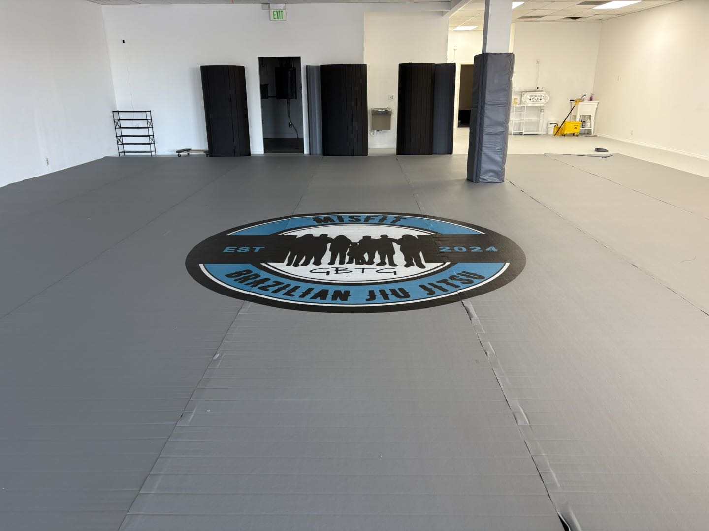
One main color creates a clean and consistent training floor, allowing the custom logo to become the primary visual feature.

One color remains dominant while the second highlights a boundary, center area, or another designated part of the floor.
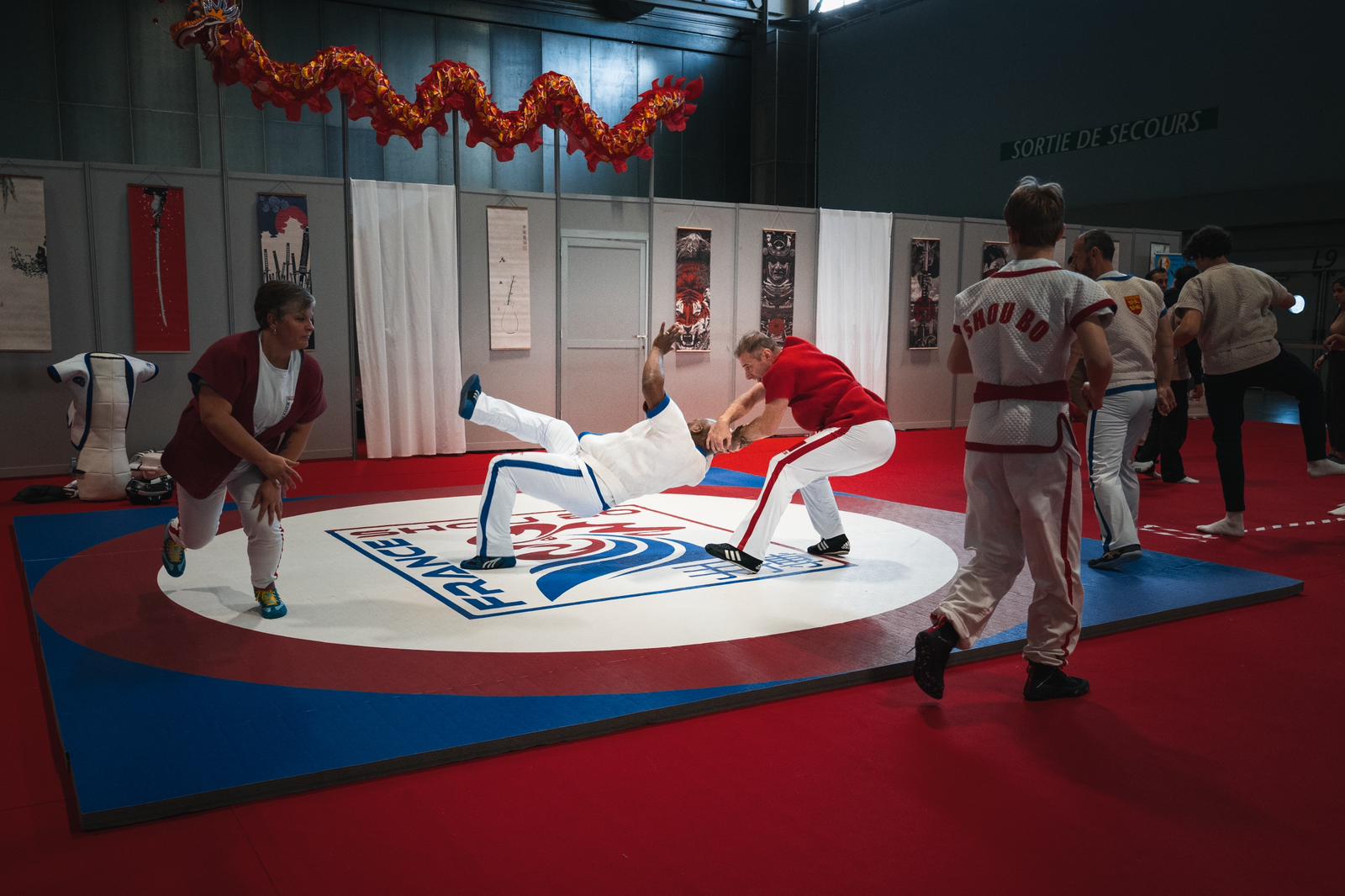
A main color and a limited number of supporting colors can identify several zones while keeping the floor visually coordinated.
The appropriate number of colors depends on the dimensions and shape of the dojo, as well as the areas the customer wants to identify. We do not apply the same layout template to every project.
The logo color and mat background should be planned together.
If the logo color is too similar to the mat color, the finished logo may not appear clearly. Adjusting the background color, logo color, or surrounding space can improve its visibility.
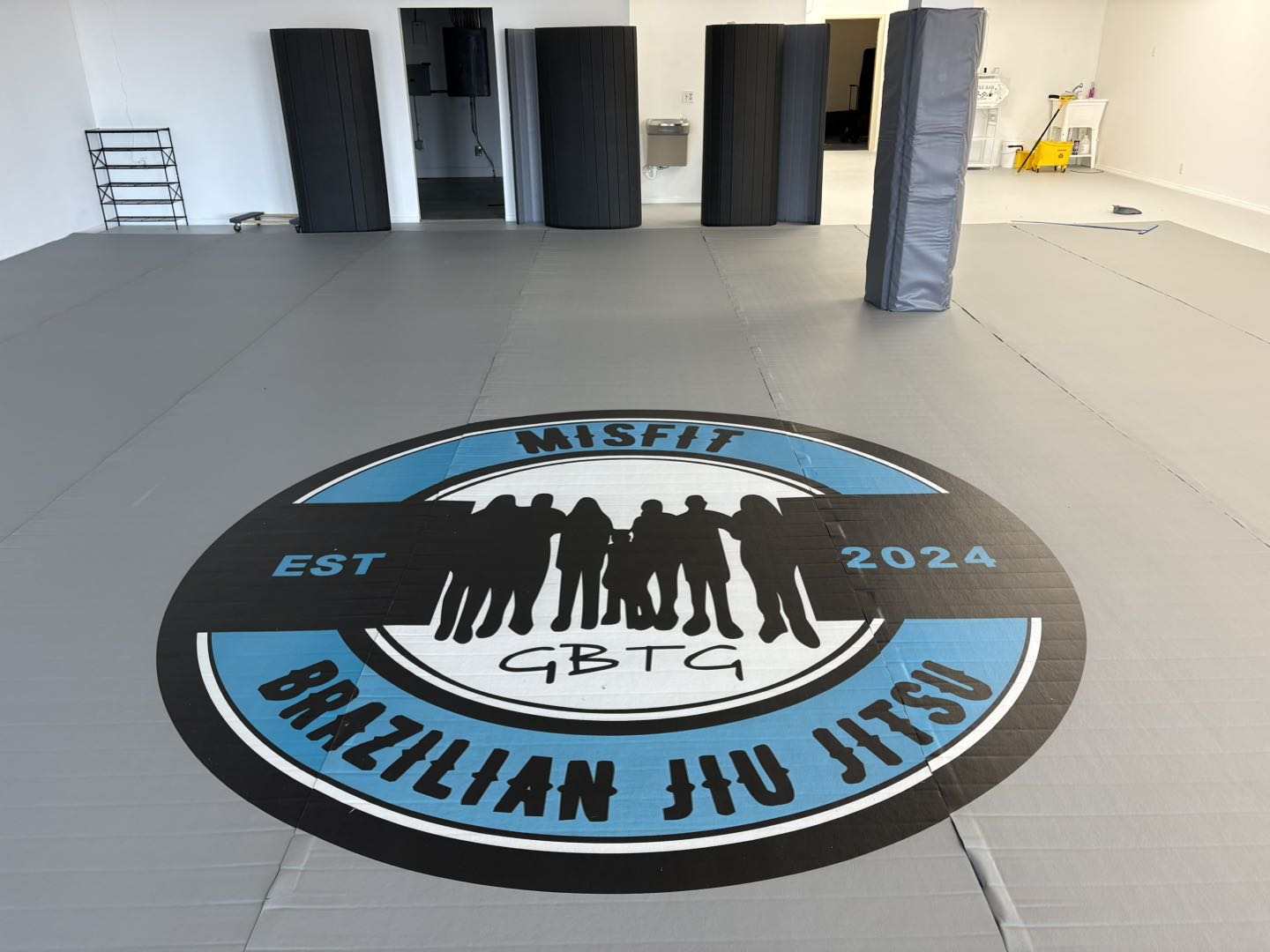
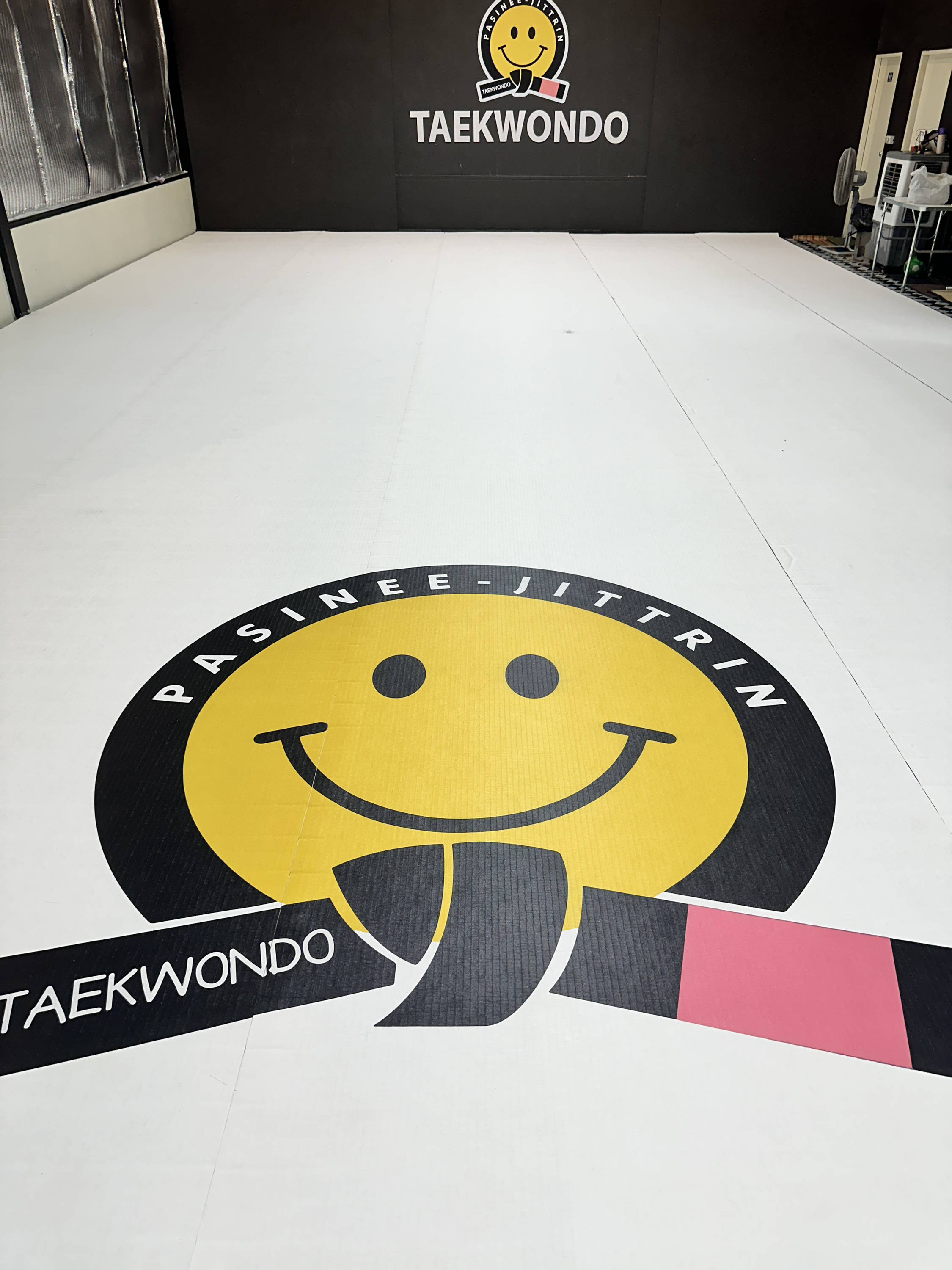

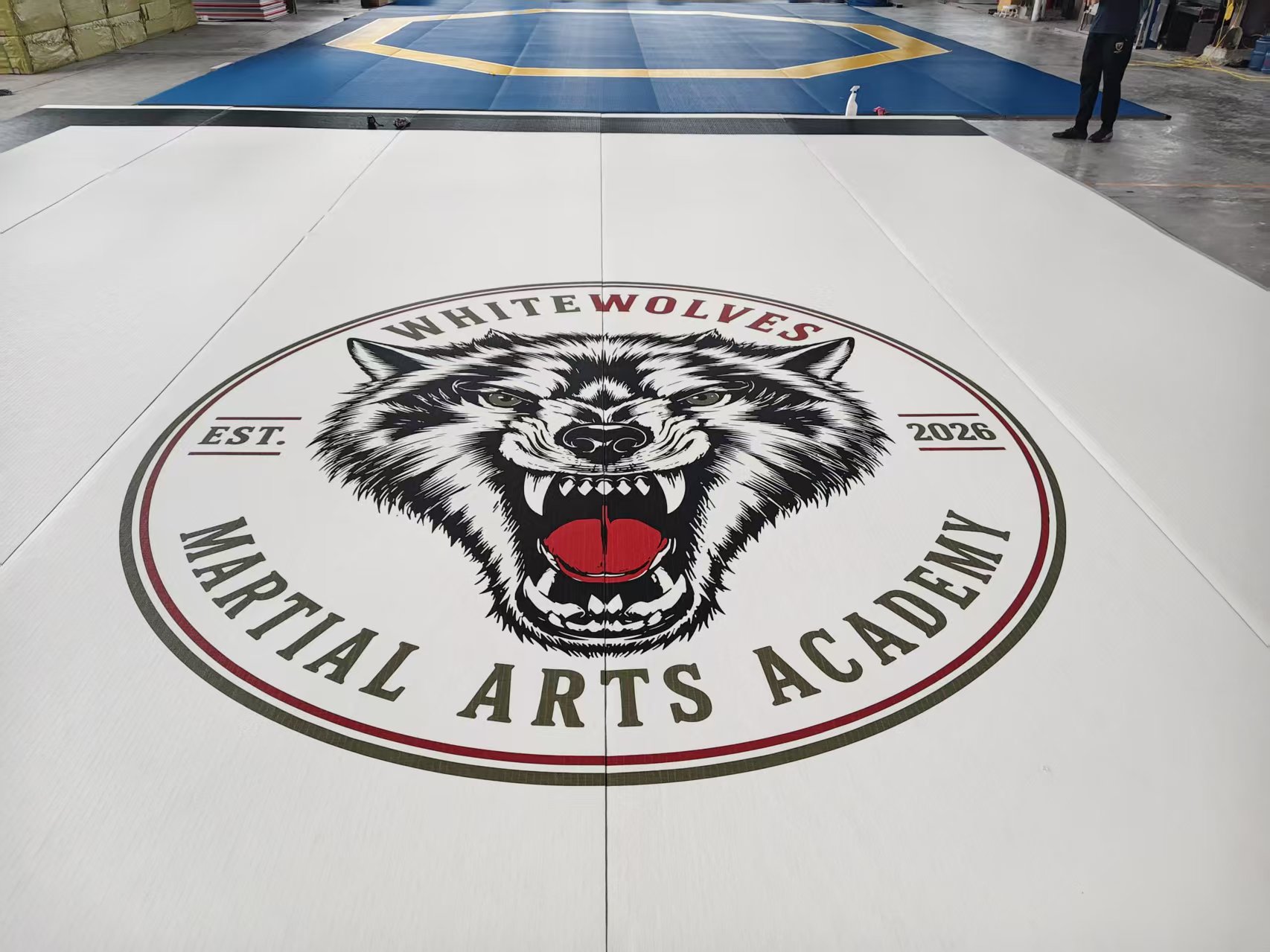
Customers can retain their original logo colors or adjust how the logo is presented according to the new mat layout. During the design stage, we review the logo file, mat colors, and logo position as one complete visual arrangement.
The floor design does not need to use every color in the original logo. Keeping the main recognizable elements and selecting colors with sufficient contrast can often produce a cleaner result.
A color name or individual color sample may not show how the full dojo will look after installation.
When customers have an actual project requirement, QT MAT can create a free mockup based on the site layout, preferred colors, and logo file.
Customers can review the mockup and tell us which parts should be retained or changed. The color arrangement, zone positions, and logo layout can then be confirmed before production.
A dojo’s professional image comes not only from its coaching and classes but also from the environment students experience.
When the roll-out mat colors coordinate with the brand, the zones are clearly arranged, and the logo is properly positioned, the space looks intentionally designed rather than assembled from unrelated elements.
This visual consistency can help new students recognize the professionalism and brand identity of the dojo when they visit or attend a trial class.
A clean, organized, and recognizable training environment can also contribute to a stronger first impression for prospective students.
Mat colors cannot replace the quality of coaching or service, but they can become an important part of how the dojo presents itself.
Customers can begin by sending QT MAT the basic project information.
After receiving this information, we can create a free mockup showing the relationship between the mat colors, zone layout, and logo.
If the first design needs adjustment, the color combination or zone positions can be revised according to the customer’s feedback before the main direction is confirmed.
QT MAT roll-out mats offer a wide selection of colors, and custom colors beyond the existing options can also be discussed according to the project requirements.
Whether you want a single-color floor, a two-color boundary and center design, or several color zones for different training spaces, the layout can be developed according to the actual site.
With coordinated logo colors and a free mockup, customers can review the overall appearance before production and confirm whether the roll-out mat design supports the dojo’s brand direction.
Share your dojo layout, preferred colors, and logo with QT MAT. We will prepare a free mockup so you can review the color and zone design before production.
Request Your Free Mockup


